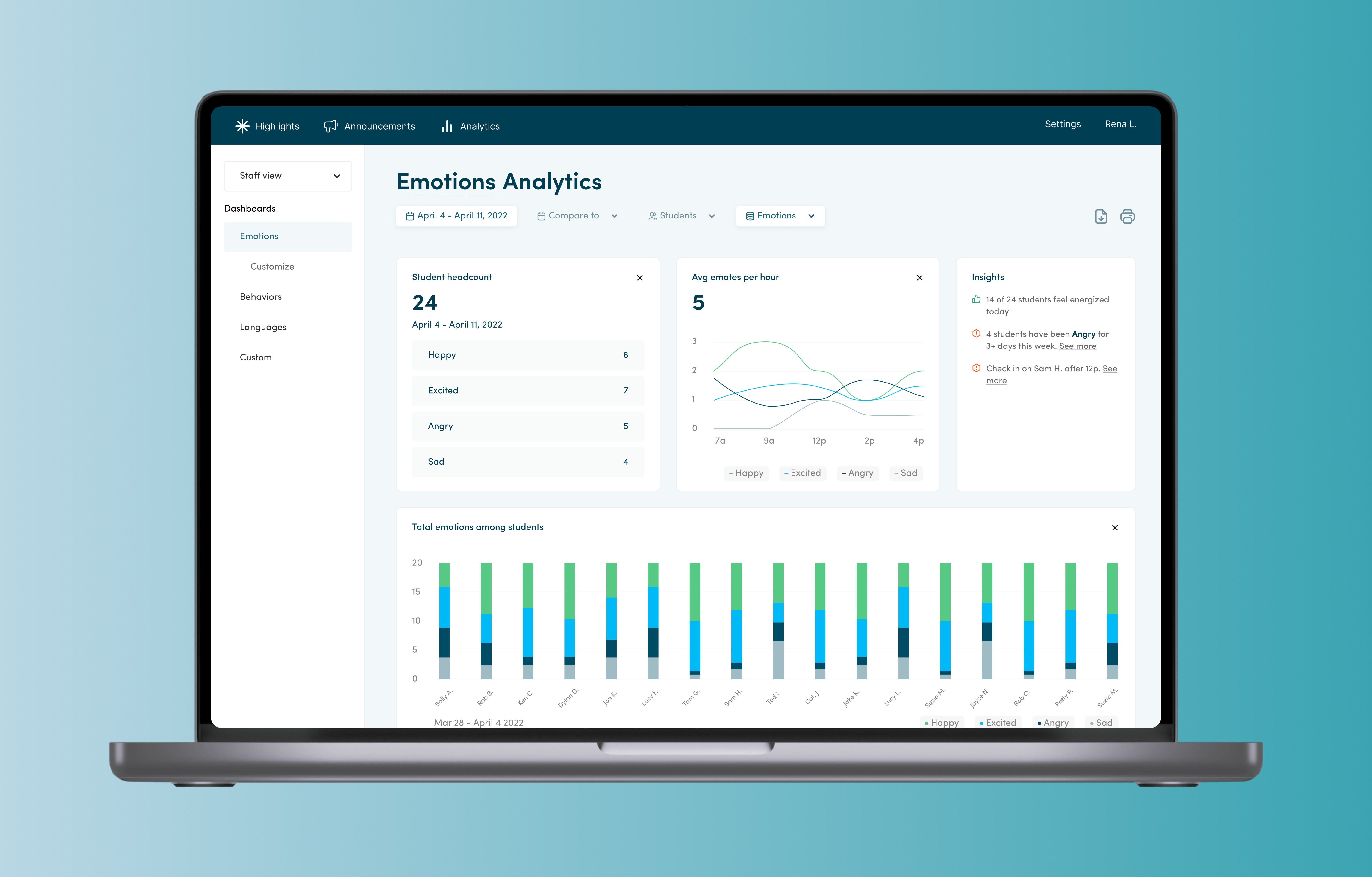
Emote
Platform
Web
Timeline
4 months (Jan ‘22 - Apr ‘22)
Core responsibilities
End-to-End Design, Design System, Research, Strategy
Role
Product Designer, UX Researcher
Context
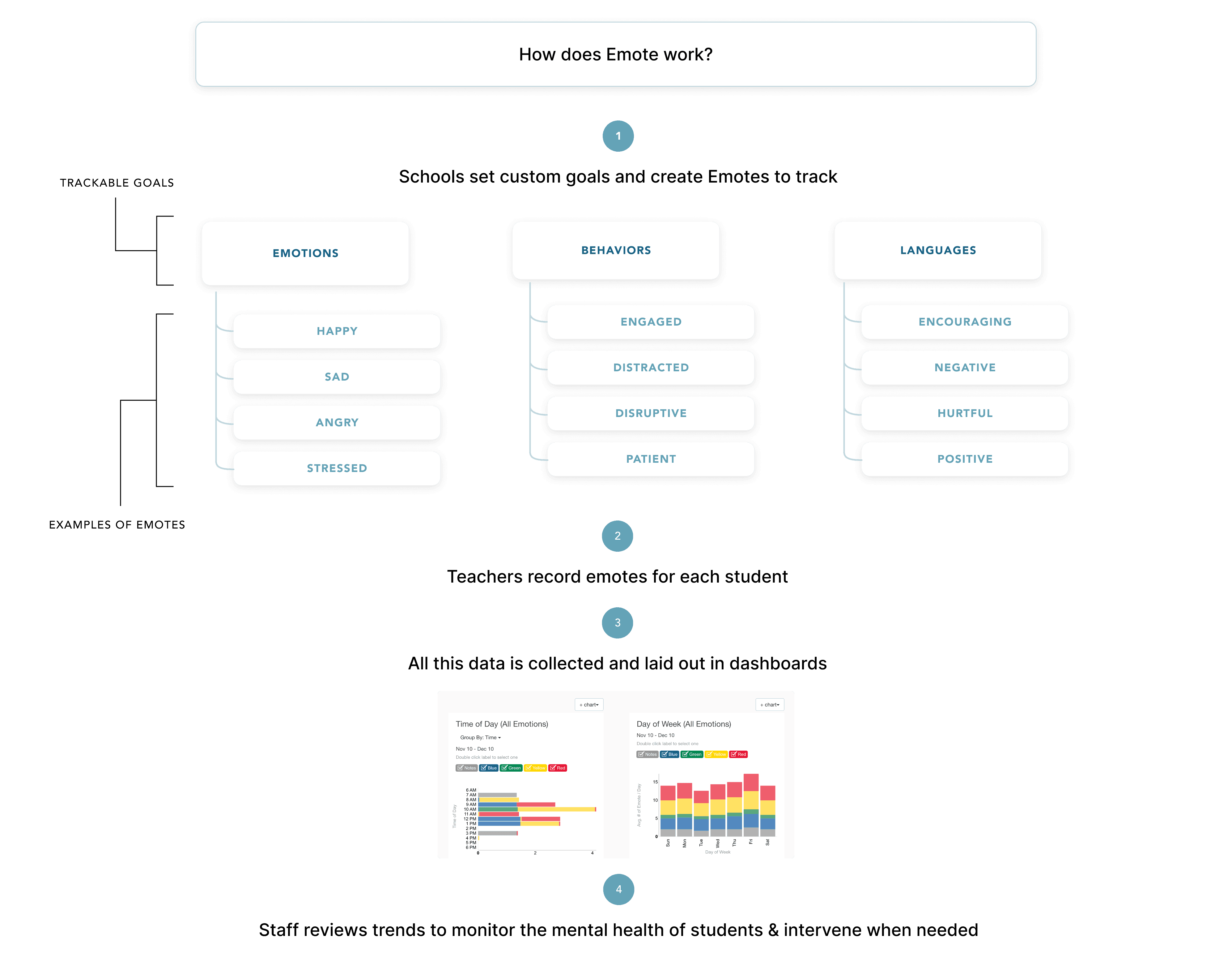
What is Emote?
Emote is a school-wide digital behavioral support tool that collects teacher-reported student data (behavioral and academic). Emote transforms data into real-time insights so that students can get the support they need faster.
Teachers & staff want to foster the best learning environments for their students and provide mental health support preemptively, but they struggle to understand the mental health insights that Emote provides. Their goal is to use insights that help drive decision making for mental health interventions.
My role
With the CEO and product manager, I redesigned the data dashboards page with the goal of lowering the barrier to understand emotional/behavioral insights so that schools can allocate mental health resources to the students that need it.
Problem
School staff struggle to understand the mental health insights from Emote
Users of Emote are teachers and support staff, such as counselors, mental health specialists, and behavioral interventionists. They want to monitor and improve the mental health of their students, however the barrier to comprehend what’s going on in the dashboards page is too high.

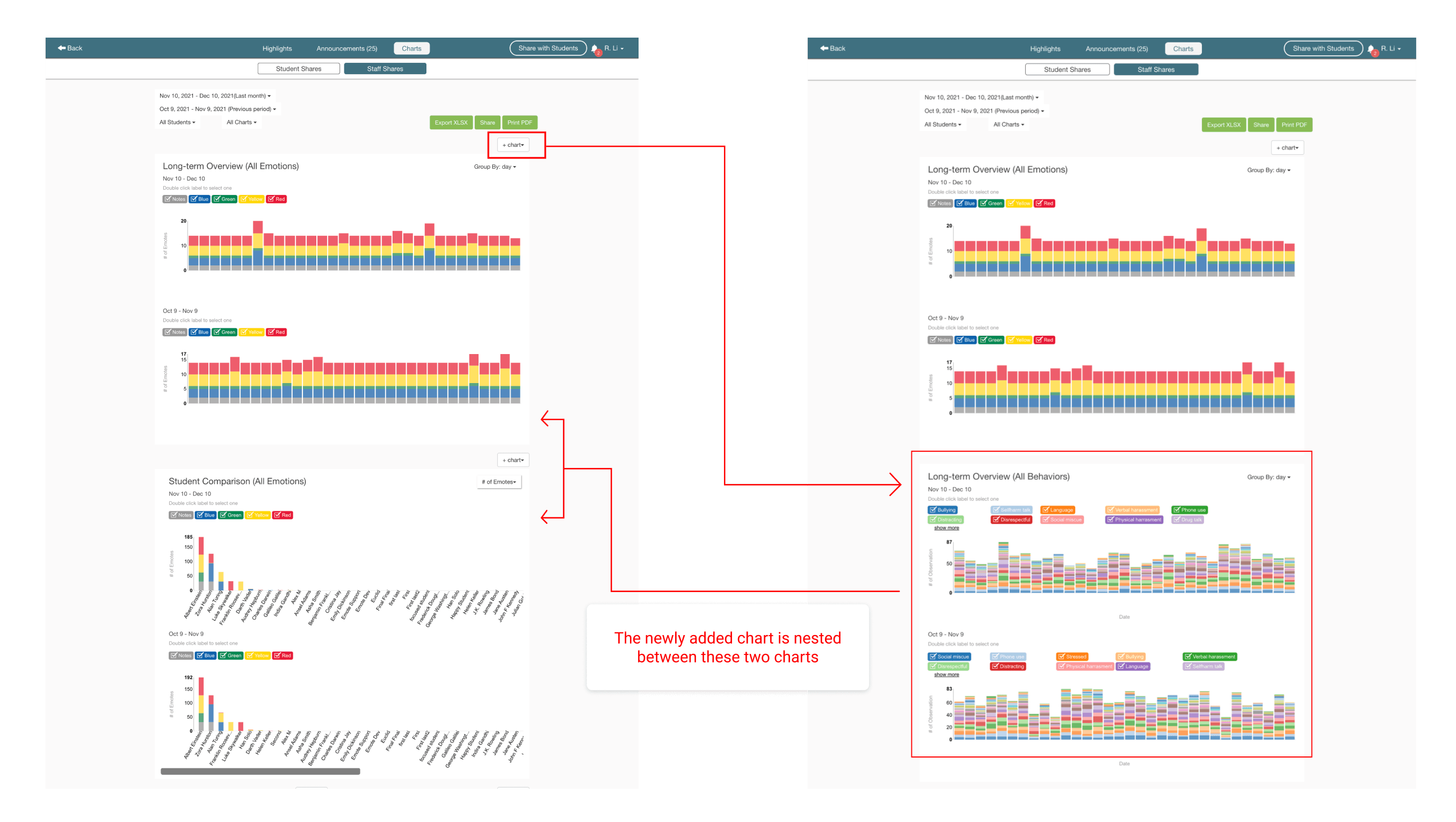
A heuristic evaluation of the current experience:
❌ Visibility of system status: There is no immediate visual feedback for where newly added charts will appear.
❌ Consistency and standard: Locations of chart controls are scattered throughout the page. Does not follow established conventions for dashboard designs. Users rely on recall rather than recognition to navigate through the page.
❌ Match between real world and system: Chart titles and buttons (+charts) are not intuitively understood.
Research
Why do teachers and staff find the dashboards overwhelming?
I interviewed 3 users to gain context on how they arrive at the charts page, their goals with Emote, and pain points with the experience.
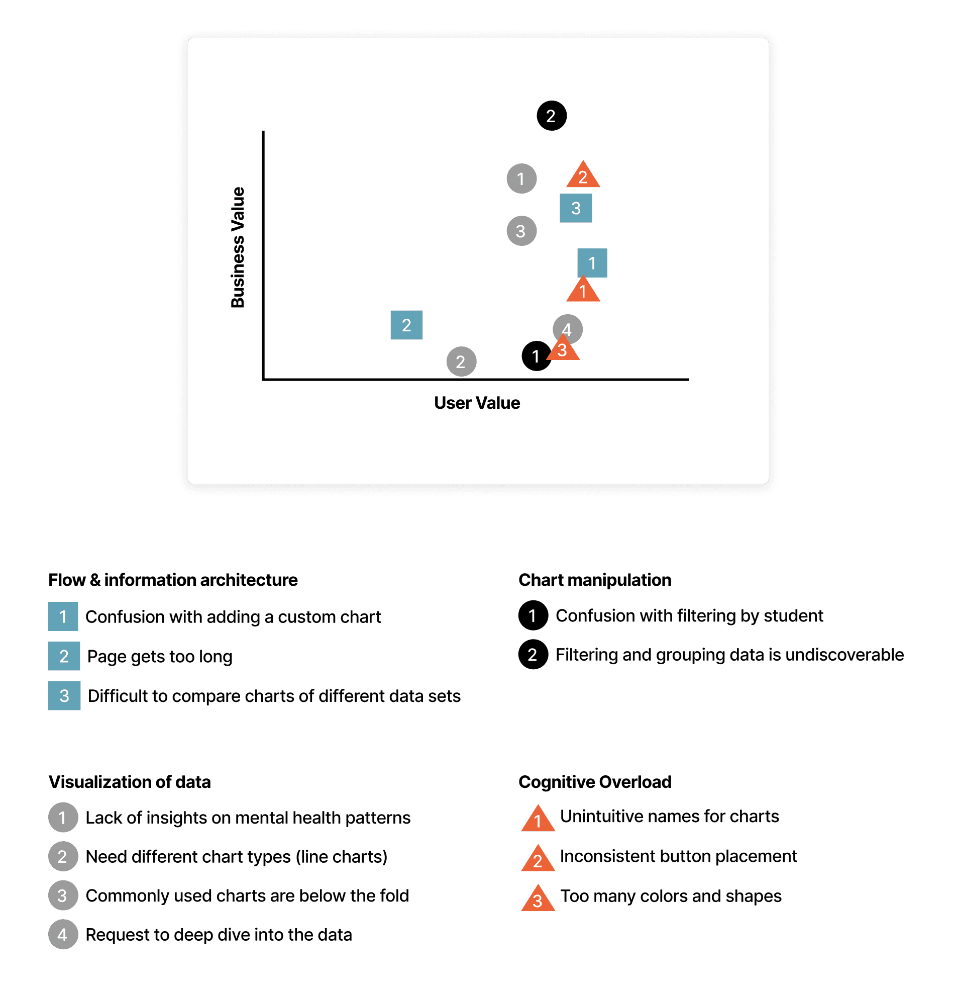
Using affinity mapping, I collected user paint points. Then I took the main problems I found and prioritized with the CEO and product manager. We mapped the business value to the user value for each problem.
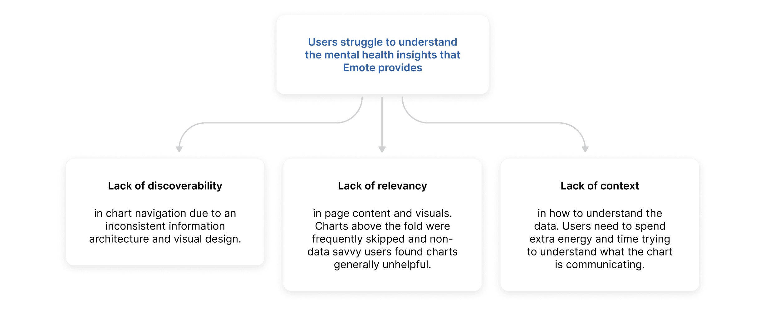
Core pain points
From the above research we distilled the issues into just the ones that would have the most impact.
Design goal
Make mental health insights clear & actionable

A childhood hero of mine, who helped make even the impossible feel possible, was Bob Ross. With careful direction and encouragement, he taught audiences how to take advantage of paint tools and techniques. He acted as the bridge between a blank canvas and a masterpiece.
💥 User impact: Students receive preemptive support, classrooms are more focused
School staff will feel less intimidated by the charts page and can easily understand insights so that teachers can put the focus back on education.
💥 Business impact: Increased user engagement
An increase in user engagement improves the company's metrics and likelihood for funding. If more users find page content to be helpful and relevant relevant, the product has the ability to cast a wider net and appeal to many different types of users, regardless of their proficiency with data. This sets up the company for growth and allows it to grow its user base, which translates to recurring revenue.
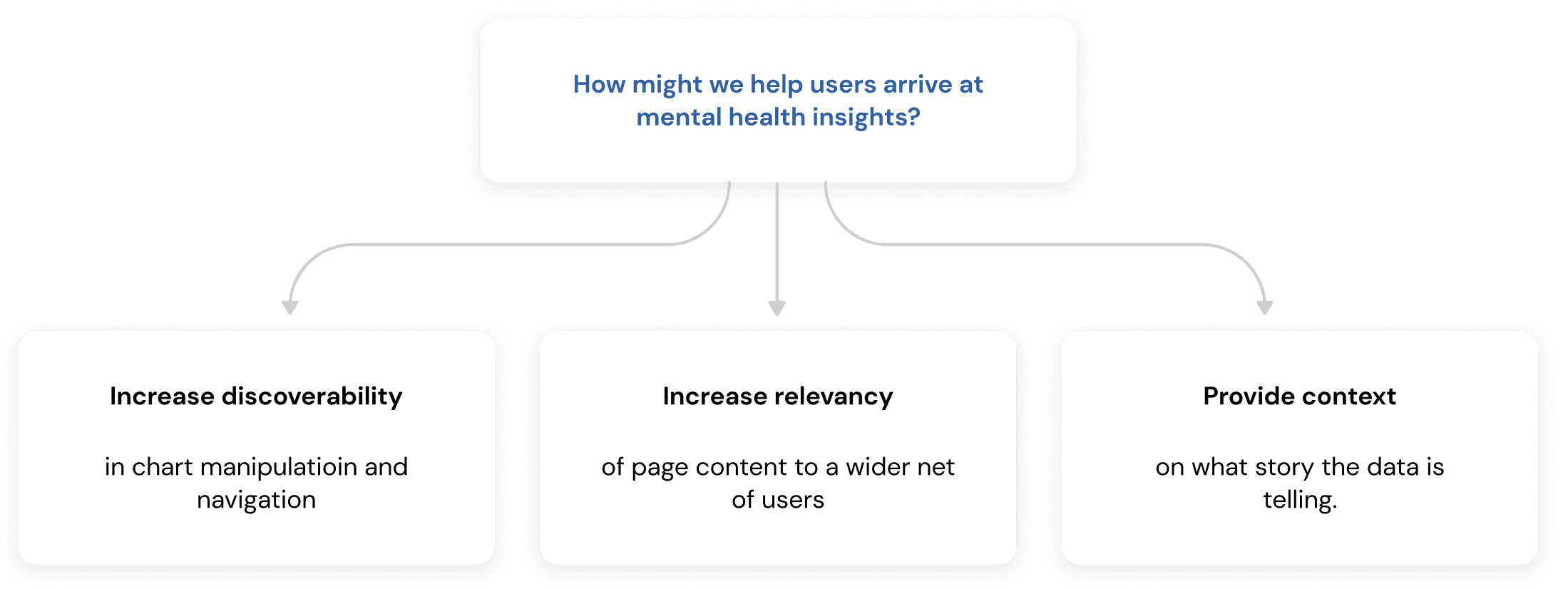
Initial supporting design goals
Narrowing the scope
Improving discoverability and relevancy are the most impactful supporting goals that will increase user engagement, therefore to keep things focused, I omitted the goal of providing context.
Ideation
How can we make users feel like they’re using something simple and familiar?
One key thing in creating a simple yet familiar experience is an intuitive information architecture. Currently, there is no structure that offers predictability, and recognition over recall. This called for a fundamental re-evaluation of how the data is currently grouped.
We know that users prioritize finding patterns in students’ mental health and behaviors in classrooms. What’s the best way to bucket this data?
I decided to use Goals as the Primary bucket because user research indicated that staff preferred to analyze 1 goal at a time, with the option to compare with another goal.
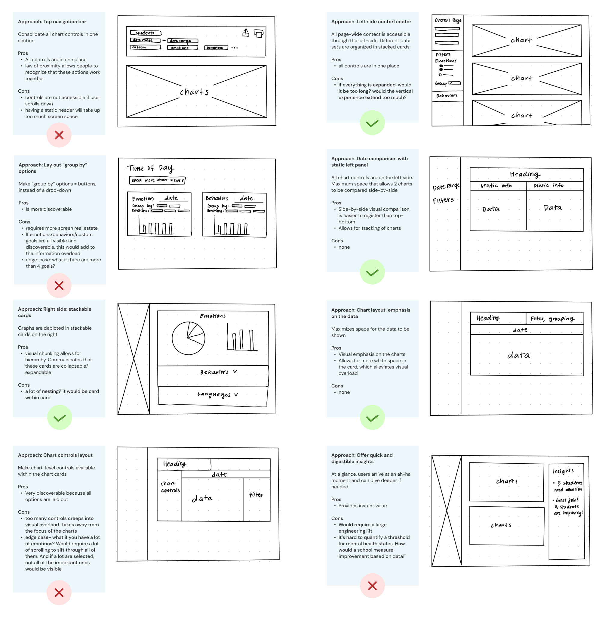
The combined concept
I opted for a left-side panel for all chart controls because this supports the F-patterned style of reading, which reinforces the way western cultures intuitively read from left-to-right. The right side of the page is designated to focus on data storytelling.
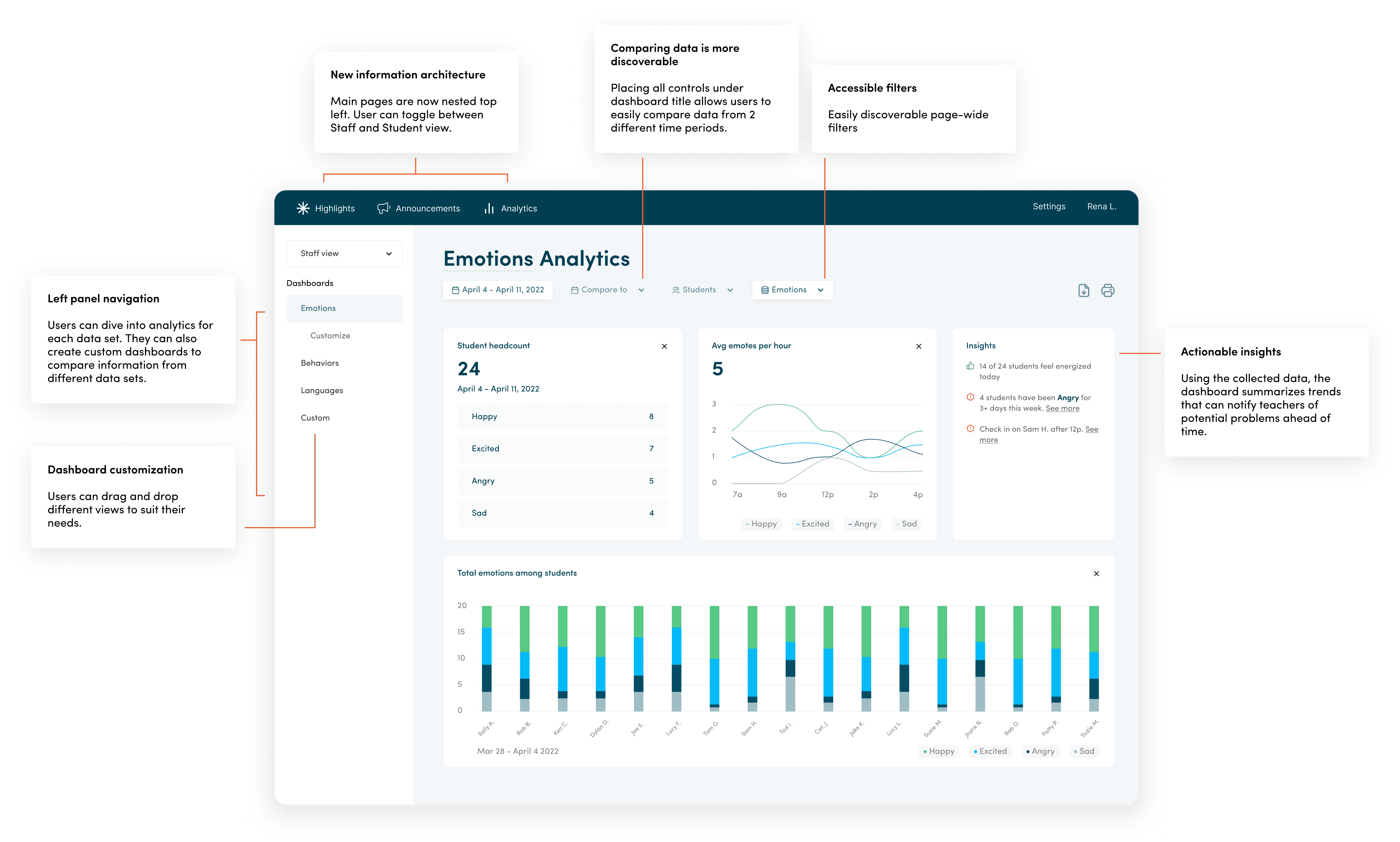
Final solution
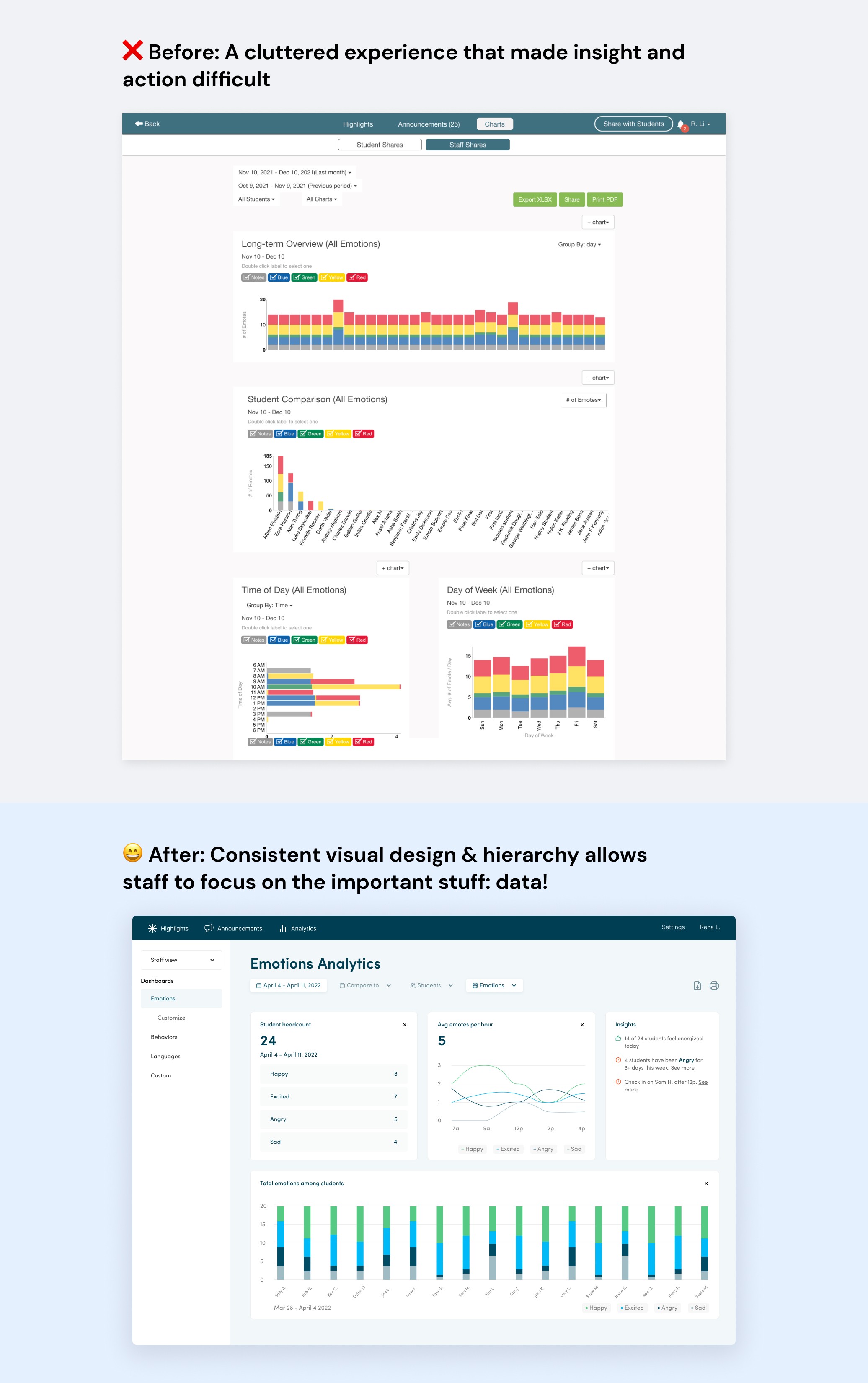
An intuitive dashboard that anyone can understand
MVP / Plan of action
For the MVP, I would prioritize:
New & stronger information hierarchy. This is a very easy engineering lift, as the current product already represents this, but it just isn’t as clear. Visually chunking the charts allows users to process information quickly and clearly.
Left-side controls panel. Although this would require a large engineering lift, this means all chart controls (filtering, grouping, date range selection, cohort selection) will all be located in one predictable area.
Update design copy of buttons. Real-world copy to create a seamless experience.
Maximize screen space for the charts. Not only does this provide a cleaner design with ample white space, but targeting this in the first milestone will set up a foundation before we start working on visual design of the charts.
Goal of the MVP: The dashboards page should lead school staff to their “ah-ha” moments as quickly as possible, with every chart control easily accessible from one place.
Measuring success
If the user engagement rate grows by X% within a defined period, the team can build out the next milestones: updating the dashboard experience with a minimalistic chart design, accessible cohort selection, and updated date selection pop-up.
I would also track metrics like new customer growth rate, CSAT score, and error occurrence rate.
Milestones 2, 3, and 4

Handoff
Passing the baton
Once the prototype was ready, I presented the solution to the engineer and prepared documentation with annotations of the design. Due to developer feedback, I revisited some of the flows of the new dashboard design and went through one more round of iteration.
💡Learning moment:
Due to project constraints, it was difficult to talk to the engineer until the very end. However, I learned that developer collaboration is extremely important early on and during the entire design process. If I were to do this project again, I would advocate to start engineering discussions during the sketching phases or even prior.
Vision of the future
If I had more time, I would consider…
Edge cases: If teachers/staff have multiple goals they want to track, and open a variety of them at the same time, this may cause the opened cards to be scattered laterally throughout the page. I’d love to further explore options for modularity, allowing the reorganizing of cards. It would be interesting to introduce micro-interactions of a drag-and-drop interface.
Personalization: In the interest of saving users’ time in setting up their ideal dashboard view, I would further explore the option to create “saved views”.
Self-guided learning: In order to provide further context on how to use the dashboards page, I would explore the impact of adding an activation flow (user tutorial).
Self reflection
Just because things are a certain way now, doesn’t mean they have to stay that way.
I learned to question the reasoning behind each design decision and if it was necessary or not. This taught me to be more intentional with my designs and to always have solid rationale to back it up.
I also learned the importance of receiving developer feedback throughout the journey. Unfortunately, this project did not allow me to talk to an engineer on the feasibility of my design during the early stages. Had I known this was the end result, I would have pushed for more communication with the engineer.
