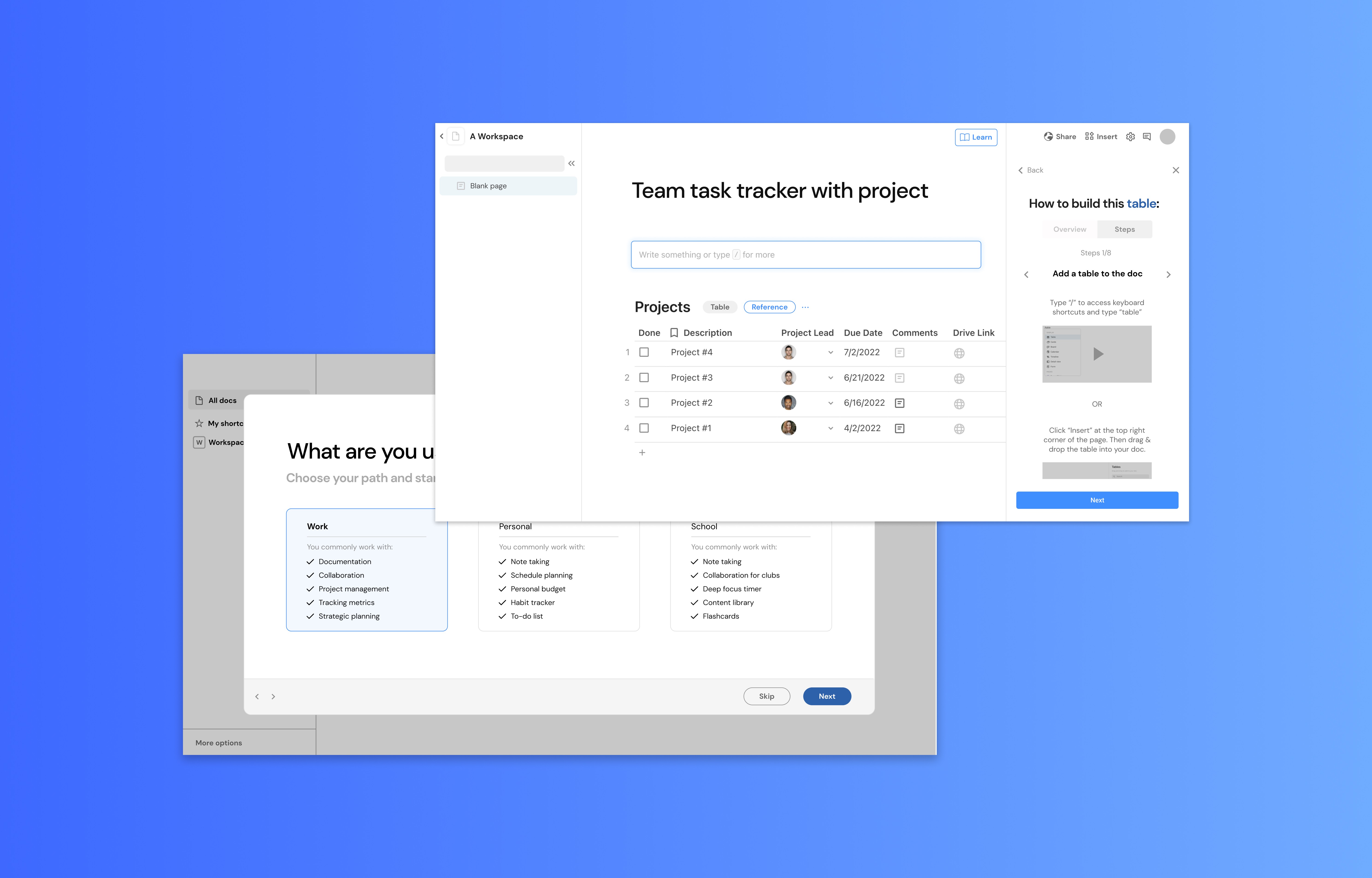
Coda (Passion project)
Platform
Web
Timeline
3 months (Feb ‘22 - May ‘22)
Core responsibilities
Research, Strategy, End-to-End Design
Role
Product Designer, UX researcher, Content strategist
Context
What is Coda?
Coda is a B2B and B2C productivity application that uses a drag-and-drop interface to build flexible documents. Within a single Coda doc, users can insert and edit databases, spreadsheets, charts, formulas, automation workflows, and more - the possibilities for what you can create are endless. Coda sets itself apart from well-known competitor, Notion, with its extensive feature set.
However, having such advanced features can come at a cost:
Users struggle with learning how to use & implement Coda’s features, leading to product abandonment.
My role
I designed a way to improve Coda’s onboarding and activation journey with the goal of providing context for users on how to use Coda’s tools to build their dream workspace.
Problem
There’s a steep learning curve with building custom Coda documents
Coda users are teams or individuals who use productivity apps for work, school, and personal. A Coda user’s main goal is to jump in quickly, start working, and stay organized.
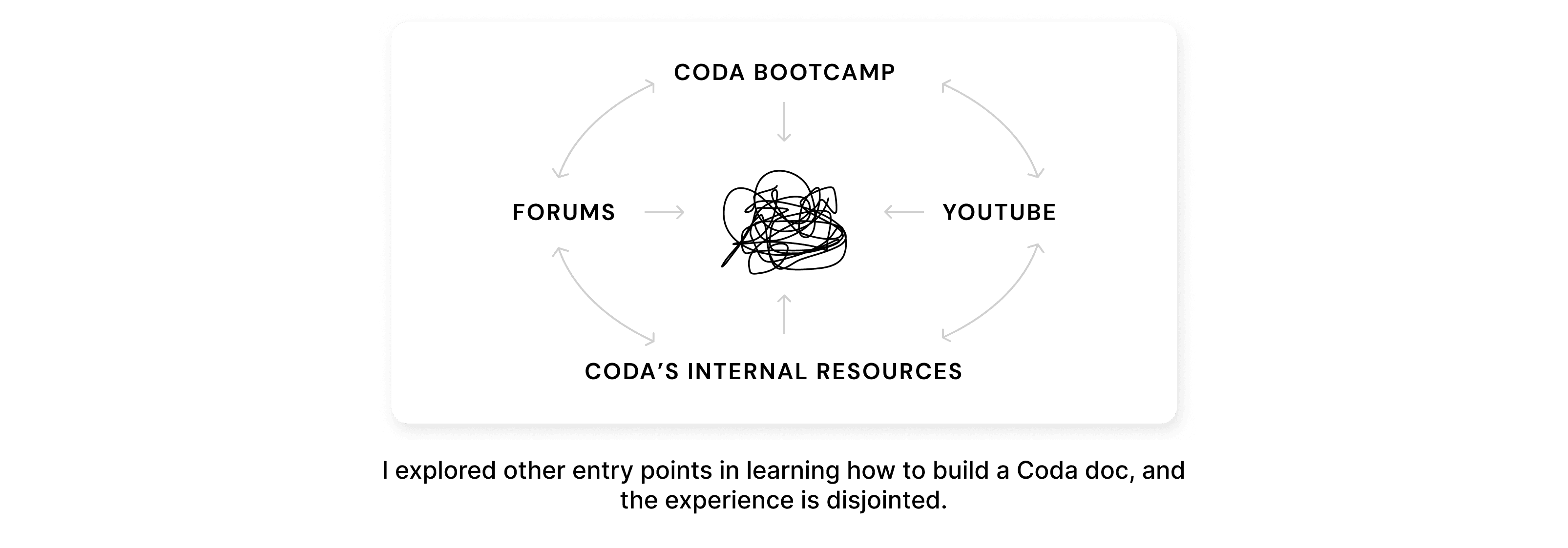
Although resources are available on multiple platforms, users don’t have the time, patience, and energy to sift through scattered information. Users experience steep learning curves with learning how to build a doc and use Coda’s features. This creates a bottleneck in their user journeys to becoming paid users - this is an activation issue and causes Coda to lose potential long-term users.
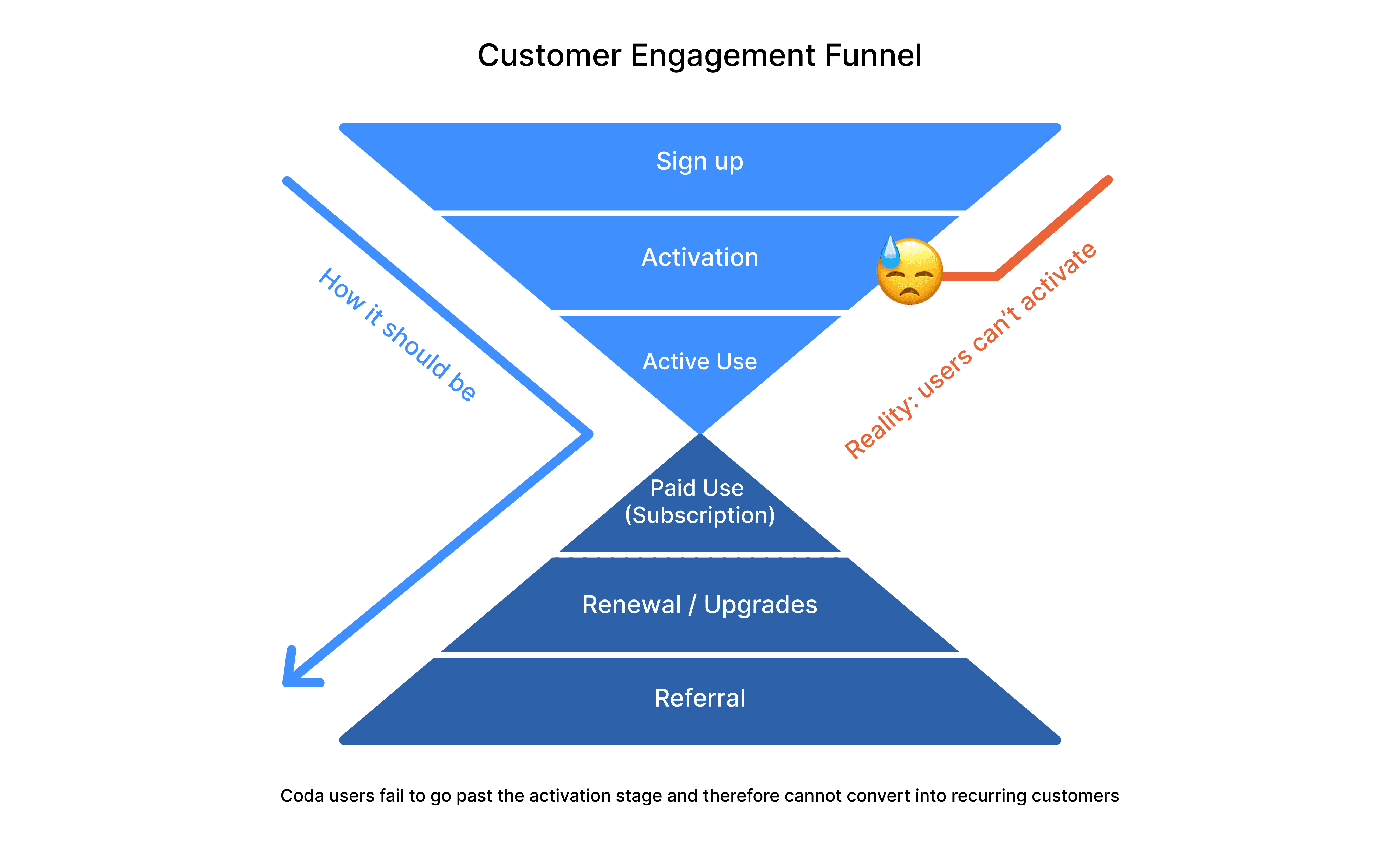
What is it like to be a novice Coda user today?
2 words: scattered and lost

The current onboarding & activation experience…
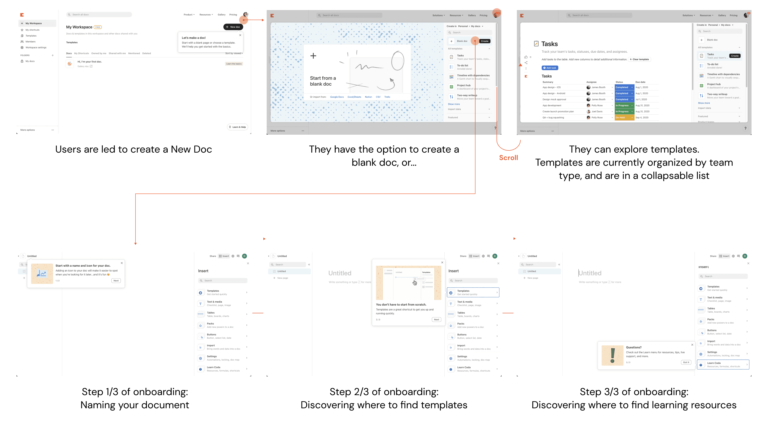
…feels like a jumbled mess
Current onboarding and activation flows only teach users how to create a new document and where to find templates/resources. The flow does not effectively convey Coda’s value as an all-in-one document platform. As a result, a Coda user’s initial experience feels very scattered, leaving the user unsupported, confused, and overwhelmed.
Research
Why are people struggling with how to build a Coda doc?
I began my research by digging through software review forums to find anecdotal customer data. To gain more context, I interviewed 6 Coda users that use it for work, school, and personal life.
I tested and validated these hypotheses:
Coda has a steep learning curve because it takes bits and pieces of mental models from different applications, but this produces a disconnect in people’s expectations and understanding of how Coda works.
Doc maker feels overwhelmed because there is no context on how to use the tools to your advantage.
🗯 But! There was more to the story:
Not only was the learning curve steep, but these hurdles were recurring...the moment users thought they knew how to use Coda, they would come across another feature that made them feel like they were back at square 1.
5/6 users said Graph 2 accurately depicts their initial Coda experience.

With affinity mapping, I analyzed user behavior and trends to arrive at 3 compelling pain points.
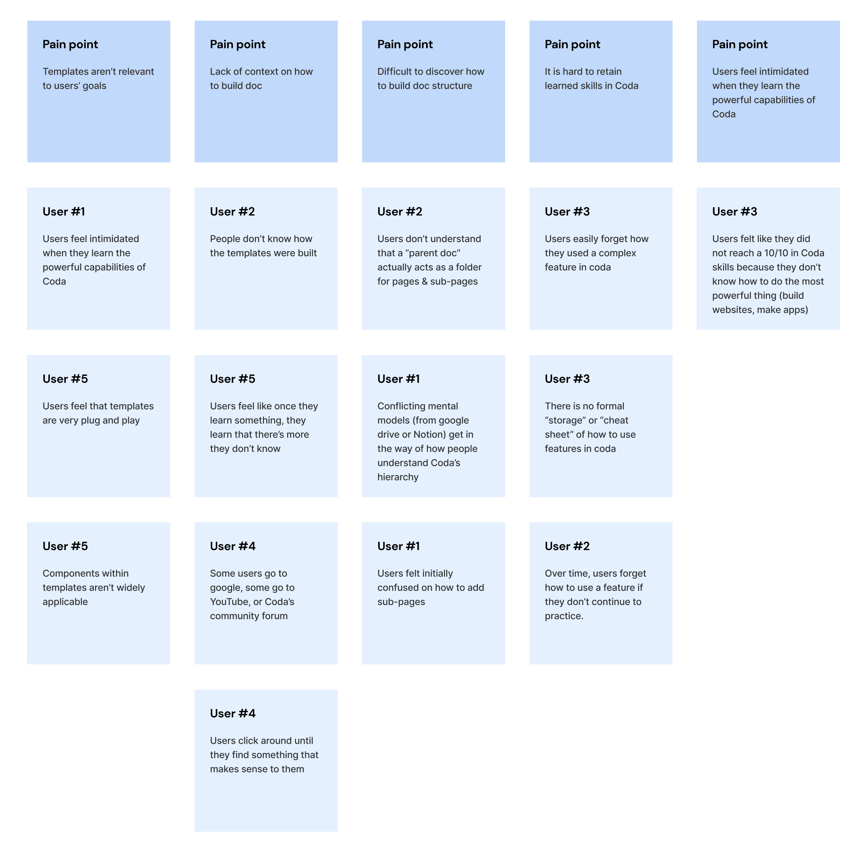
Summary of painpoints
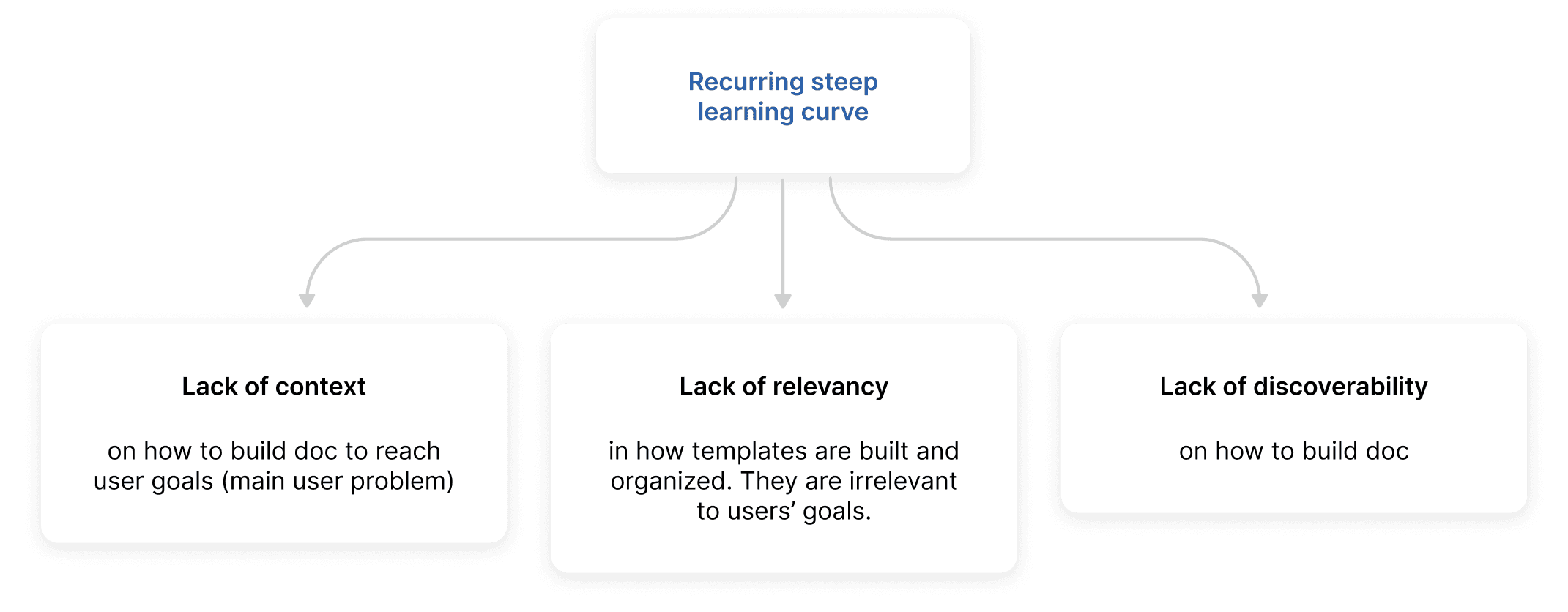
Design goal
Make learning how to use Coda easier for novice users
A childhood hero of mine, who helped make even the impossible feel possible, was Bob Ross. With careful direction and encouragement, he taught audiences how to take advantage of paint tools and techniques. He acted as the bridge between a blank canvas and a masterpiece.

Initial supporting design goals

💥 User impact: Increasing ease and efficiency
Instead of wasting time feeling confused and stitching together knowledge from scattered resources, users could spend more time collaborating and getting stuff done.
💥 Business impact: A stickier product!
As users gain more knowledge behind a product, they will become increasingly more embedded. Once free users become activated users, they are more likely to upgrade to a paid subscription, increasing Coda’s user retention rate and recurring revenue.
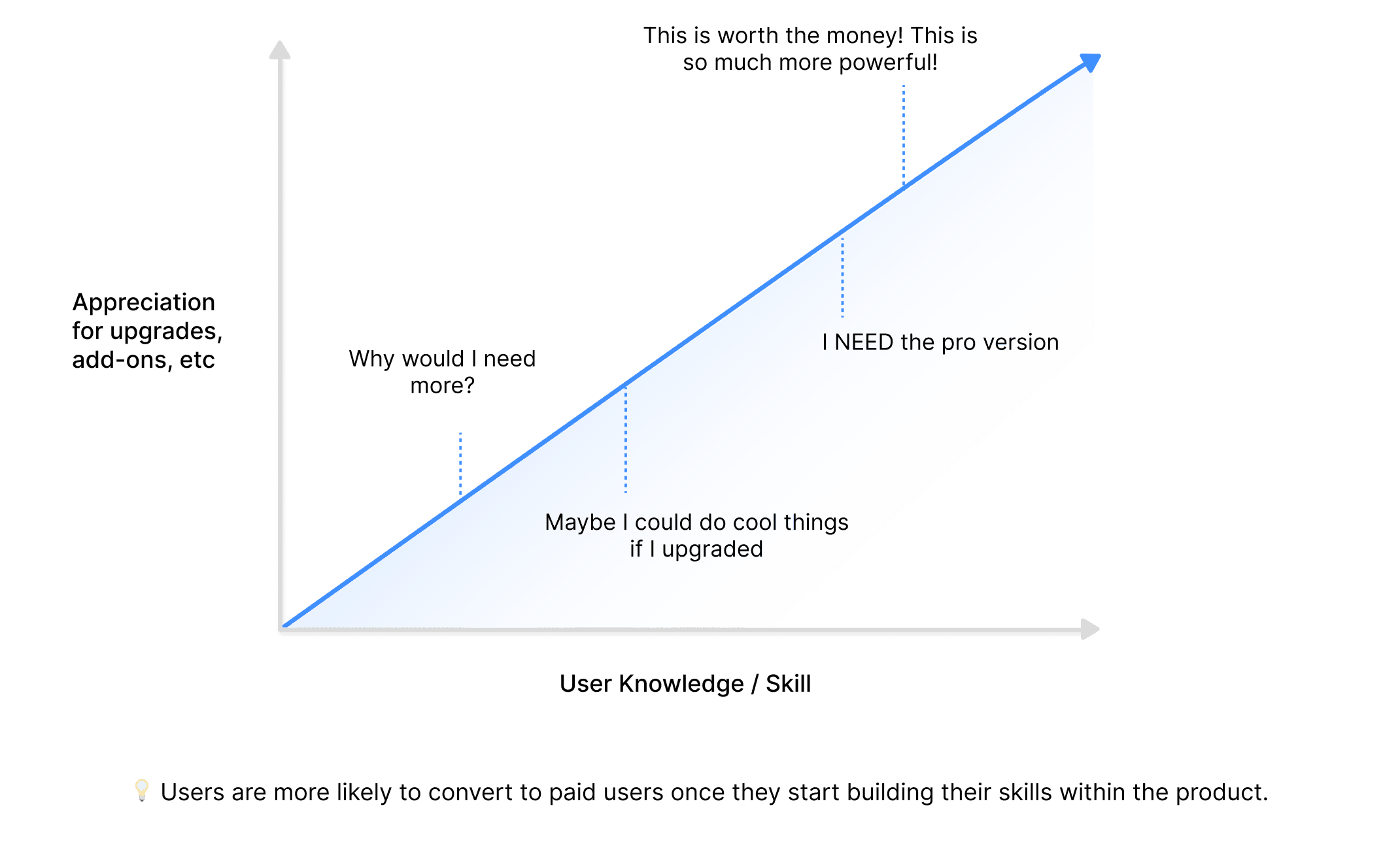
Scoping
I decided to omit the design goal, make doc-building tools more discoverable, since solving for context and relevancy best supports my overarching goal of reducing Coda’s steep learning curve. Later on during the sketching phase, I developed a visual design goal to guide my iterations: inspire users to take action on the context they just gained.
Ideation
How might we help Coda users easily learn how to use their “paintbrushes” to create a masterpiece?
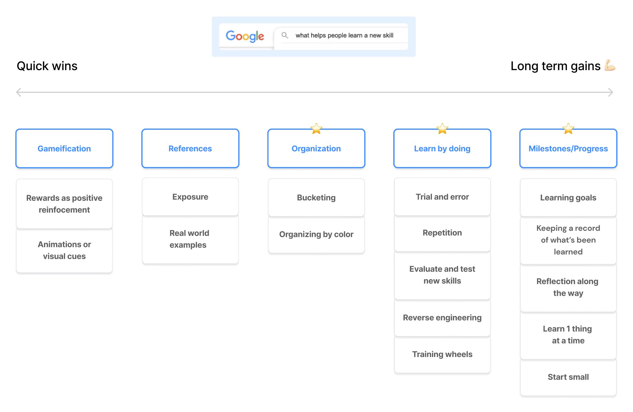
While keeping design goals in mind, I knew that at the core, the activation issue was a learning issue. That’s why to guide my ideations, I looked towards the psychology of how people learn new skills.
After a quick google search of “what helps people learn a new skill”, I organized my findings in buckets sorted them from least to most impactful for long-term learning success (aka, skills are retained in memory). I decided to place more focus on tactics centered around Organization, Learn by doing, and Milestones/Progress because these were more in favor of long-term gratification.
Sketching ways to provide context and inspire users to take action
I chose to move forward with concepts around visual chunking, step-based guidance, and flexibility in the level of guidance needed. Although I thought the ability to track milestones would offer a satisfying experience to users, leaning in this direction would be taking Coda’s focus away from a productivity app and towards a learning platform. With that exploration, the learning feels more like a primary feature of Coda, where it should be supplemental. Coda is not a learning app. It is for getting stuff done.
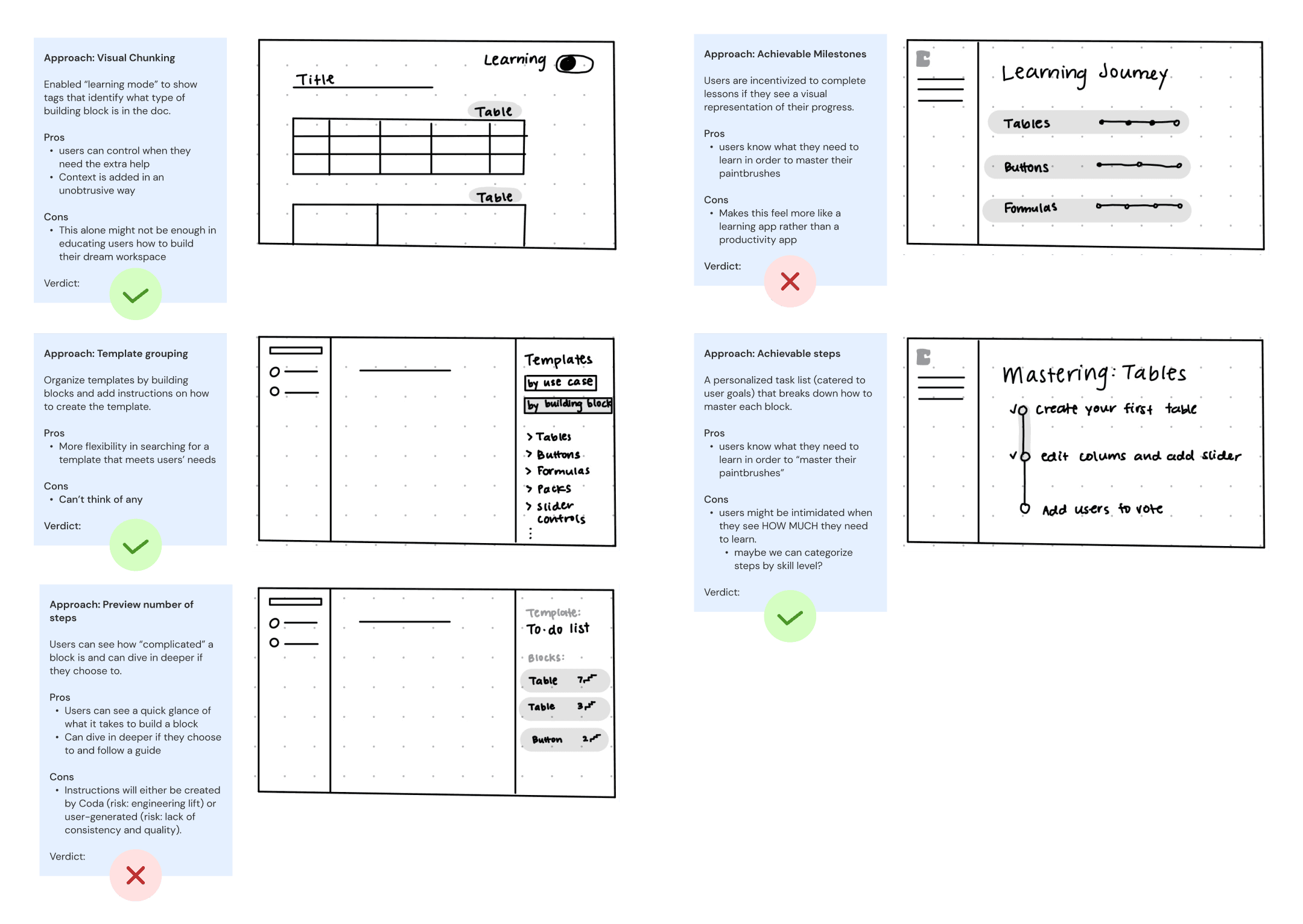
Explorations: A new user flow for activation
I tried countless ways to provide context while encouraging users to engage in an active learning style (learning by doing). In tackling design goals of adding context and improving relevancy while inspiring action, I crafted a flow that begins with a questionnaire and ends at a “sandbox”: a place on the page for users to try, fail, and succeed while following step-by-step instructions.
(make these slideshows)
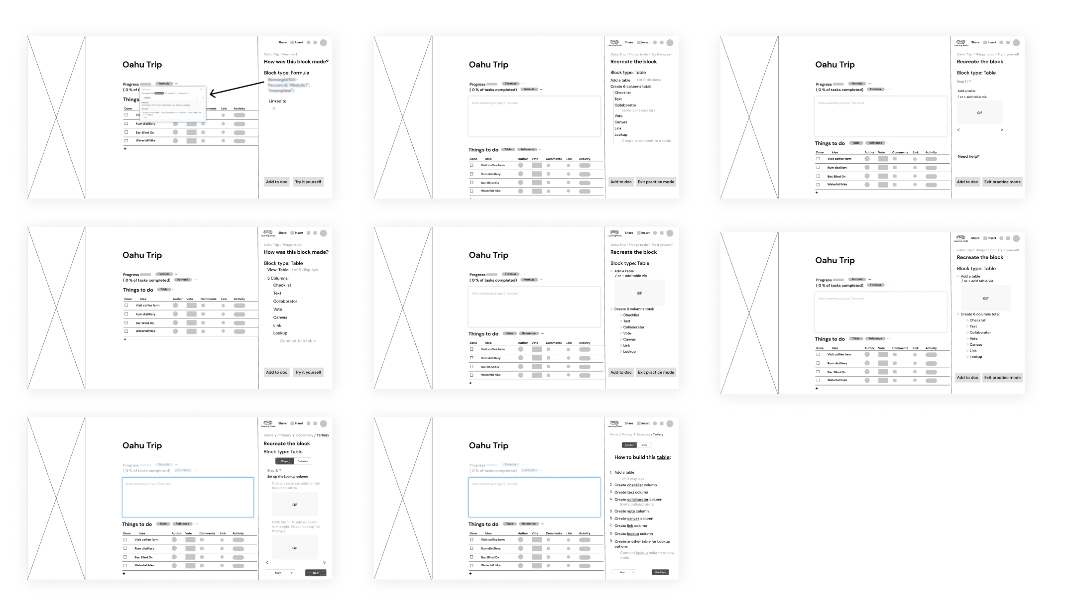
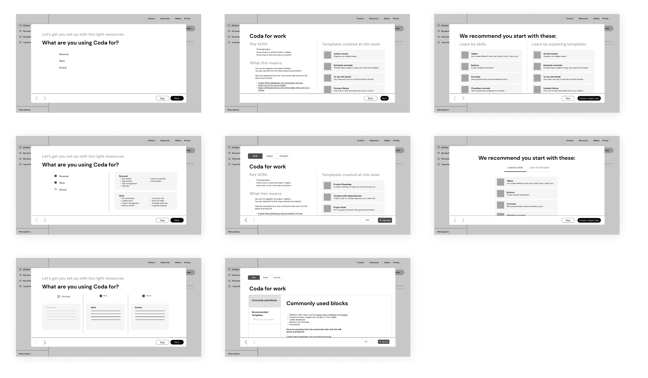
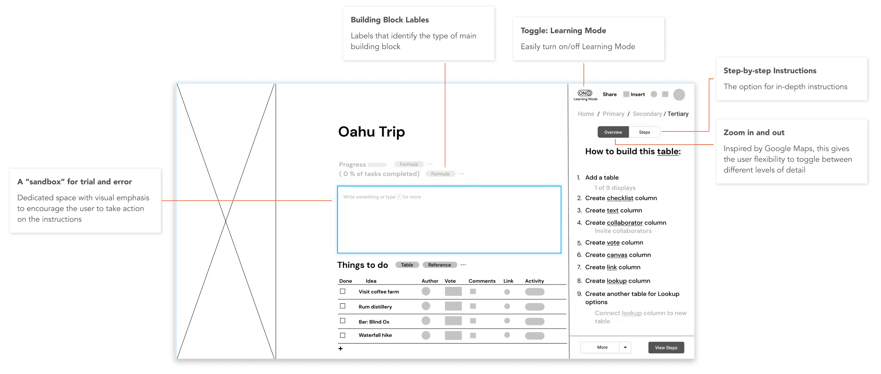
The combined concept for step-by-step learning
The top wireframe contenders were those that:
offered maximum guidance
while maintaining some level of flexibility to opt for higher-level guidance
provided delayed gratification
maximized active learning & engagement
Validation
Testing the intuitiveness and effectiveness of guided learning
I conducted usability testing on 3 users - 1 beginner and 2 veteran Coda users.
First, I tested how intuitive it was for people to choose a Coda path and understand where the questionnaire was taking them. Once they went through that, I evaluated how they interacted with the guided tutorial and how valuable (or invaluable) the step-by-step guidance was for their learning journey.
🏆 Wins!
3/3 felt motivated to continue through the step-by-step guide. It felt achievable, and it bridged their learning gap between point A and C.
3/3 felt overall confident about their ability to recreate docs with the help of Learning Mode.
🛠 Areas of improvement
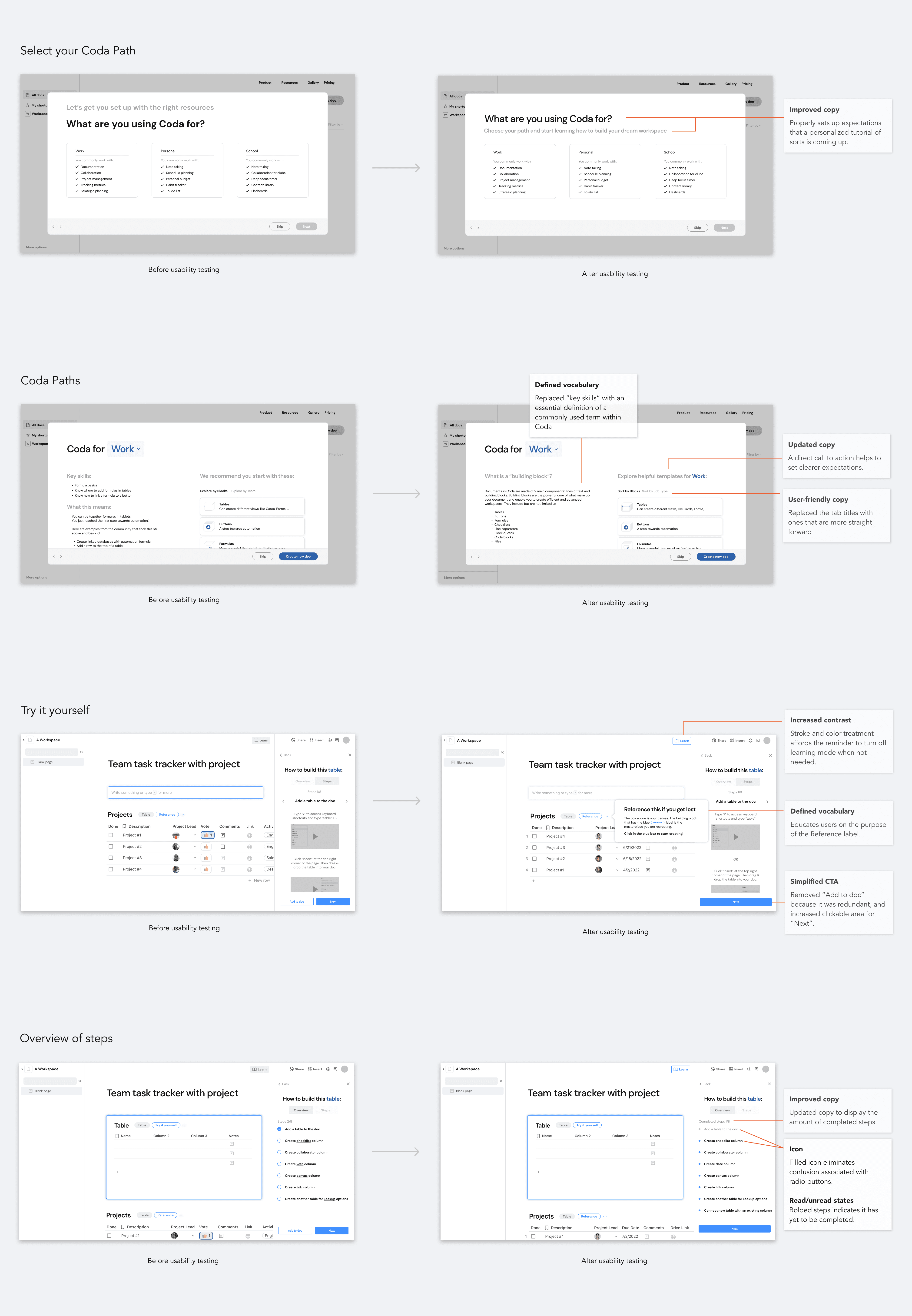
2/3 struggled to understand what the goal of the entire user flow was. It wasn’t immediately clear that the questionnaire would lead them to some form of a “try it yourself” tutorial.
3/3 struggled to understand app-specific jargon.
2/3 found the radio buttons in the Overview of steps confusing. They thought they would be clickable.
2/3 did not realize that Learning Mode was still enabled even after exiting the guided tutorial.
Iteration
Iterating after user feedback
Based on the feedback from usability testing, I aimed to focus my efforts on 3 initiatives within the proposed user flow:
Improving copy
Clarifying jargon
Adjusting visual design
Final solution & prototype
Creating a smoother activation journey for novice Coda users
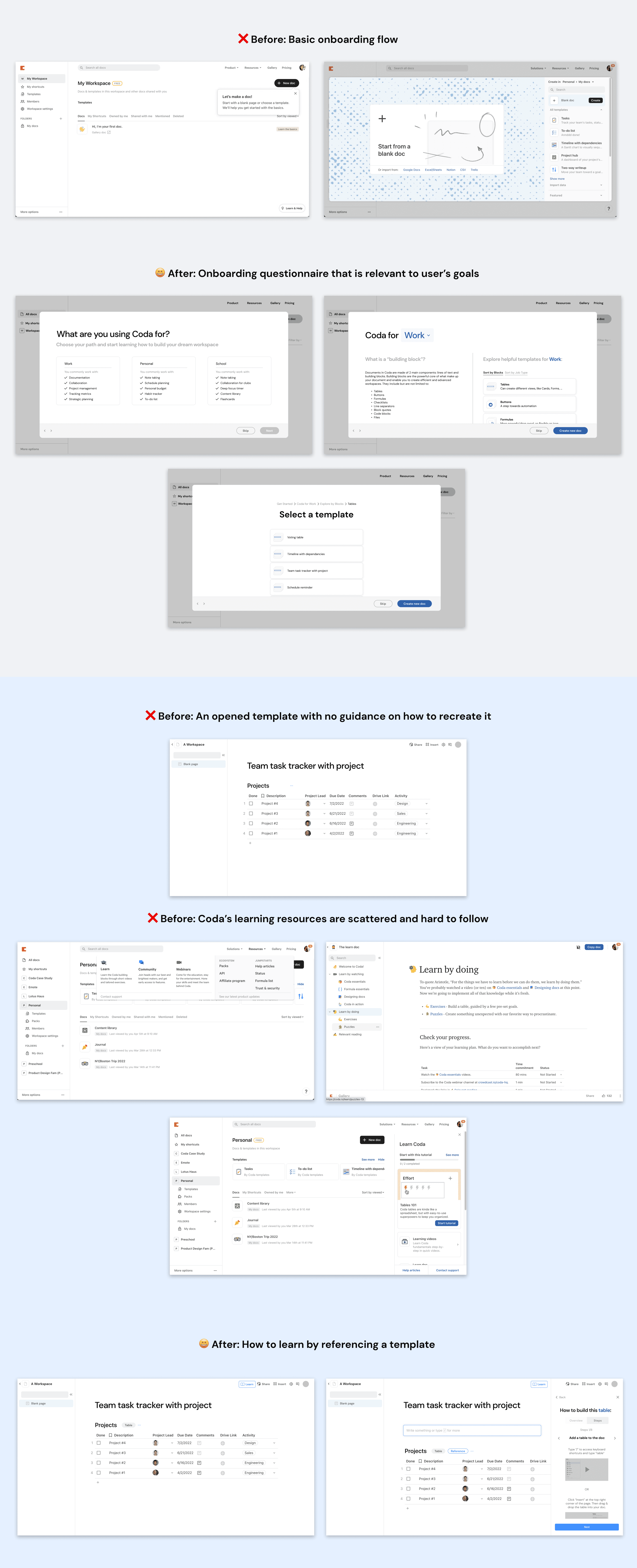
After making adjustments, users understood that the goal of the series of interactions was to gain context and practice using Coda. Simple changes made for a big impact: users noted that the improved copy and added context around jargon solved for their initial confusion. Overall, they noted that they felt more confident about using Learning Mode as a helpful reference whenever they need it.
MVP / Plan of action
For the MVP, I would prioritize:
the buildout of the step-by-step instructions. Although it does require an engineering lift, these instructions are essential to providing enough context to users.
a basic questionnaire to align users on their Coda path. This is an easy engineering lift as it is essentially a page in the format of a form.
the Learning Mode button, as users need a discoverable enter/exit point to the step-by-step instructions.
How I would measure success:
It’s important to define the activation point(s), aka the in-app events that have to take place for a a particular user persona to gain value from Coda.

If X% of users activate within a defined period and we see an X% increase in user retention rates from those users, the Labels, Sandbox, and Overview of steps can then be developed (in that order). I would also track metrics like stickiness ratio, conversion rate, and trial-to-paid conversion rate.

Vision of the future
More personalized recommendations
A future opportunity would be to further personalize the Coda paths at the beginning of the user flow. For simplicity and a low engineering lift, my proposed solution has 3 basic paths: work, school, and personal. However, humans are multifaceted and use productivity apps for their own unique goals. I would want to explore the possibilities of creating a more detailed questionnaire that considers multiple traits, characteristics, and habits. Focusing on this would take more resources but could make the Coda experience feel more applicable to each user’s life, further improving the onboarding and activation experience.
Introducing such a flow would also help Coda gather data on its users to further improve customer acquisition strategies.
Self reflection
Let go of personal bias
One of my biggest challenges throughout this case study was letting go of a personal bias for what the solution should be, and leaning into the research to guide my ideations. I learned that I shouldn’t force a user problem to fall within a certain type of business problem, rather it’s sometimes better to step back and constantly evaluate if I am leaning into a direction where both the user and business feel heard.
Prior to embarking on this case study, my design process was unstructured and scattered (very much like Coda’s current learning experience). With the help of my mentor, Jennifer Wong, I learned to zoom in and out between user needs and business impact, set clear design goals, and never stop iterating.
